
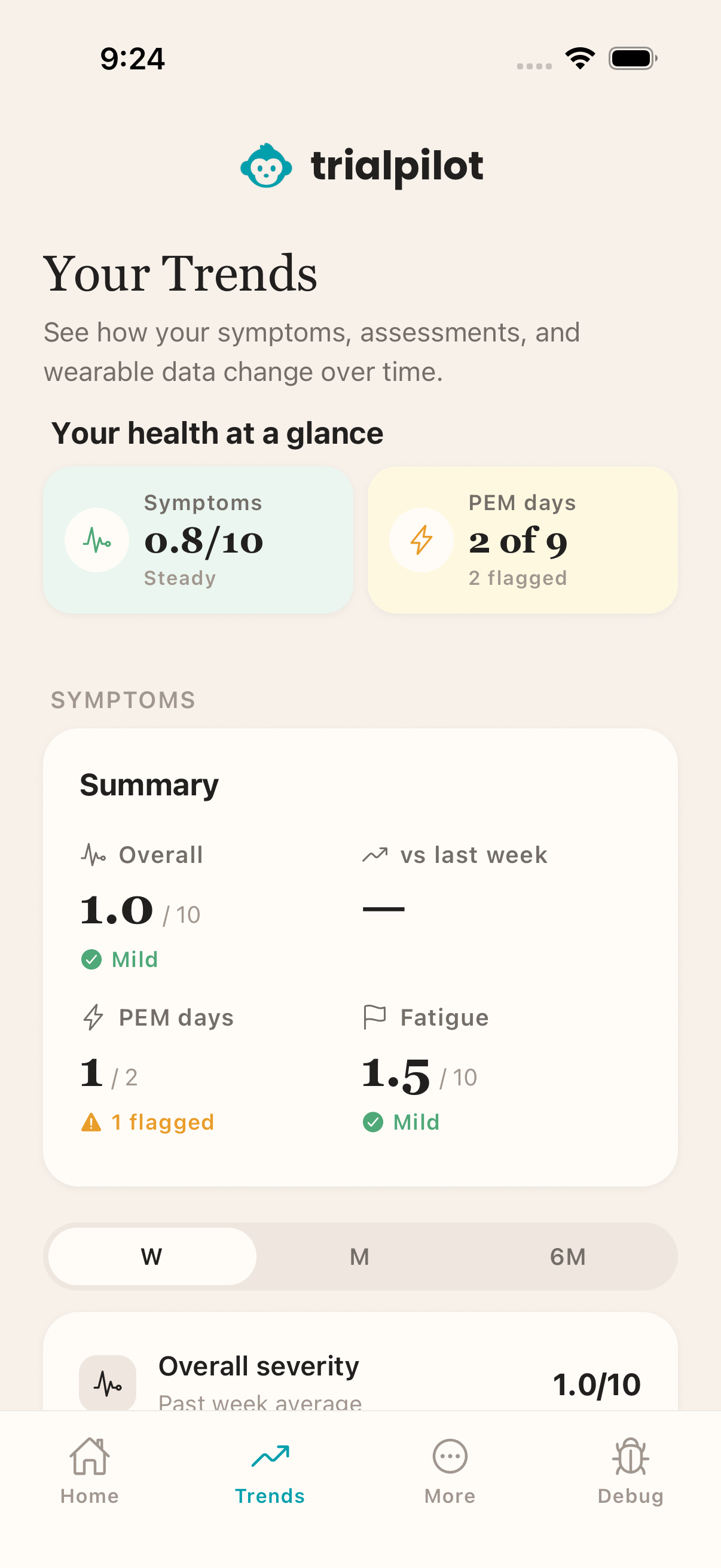
The Trends tab gives you a calmer way to see what your data is doing over time. Instead of a wall of numbers, you get simple views of your own patterns — so you can notice what is changing without having to dig for it.
Everything here is about your data, shown back to you. These views are meant to inform, never to pressure you toward a target or make you feel behind.
What you can see in Trends#
What appears in Trends depends on your study and on which devices you have connected. Depending on your setup, trends may include:
- Symptoms — how the things you track in check-ins have moved over time.
- Activity — steps, distance, and energy from your phone or wearable.
- Wearable measures — things like heart rate, resting heart rate, heart-rate variability, and sleep, when you have connected Apple Health or Health Connect.
- Pacing — views built for energy-limiting illness, described below.
- Assessment results — how your answers to study questionnaires have changed.
A trend appears once there is enough data for that measure. If a card has not shown up yet, it usually means the app does not have enough data to draw something honest — it will appear as data builds up. To connect a device or check syncing, see Wearables and health data.
Pacing#
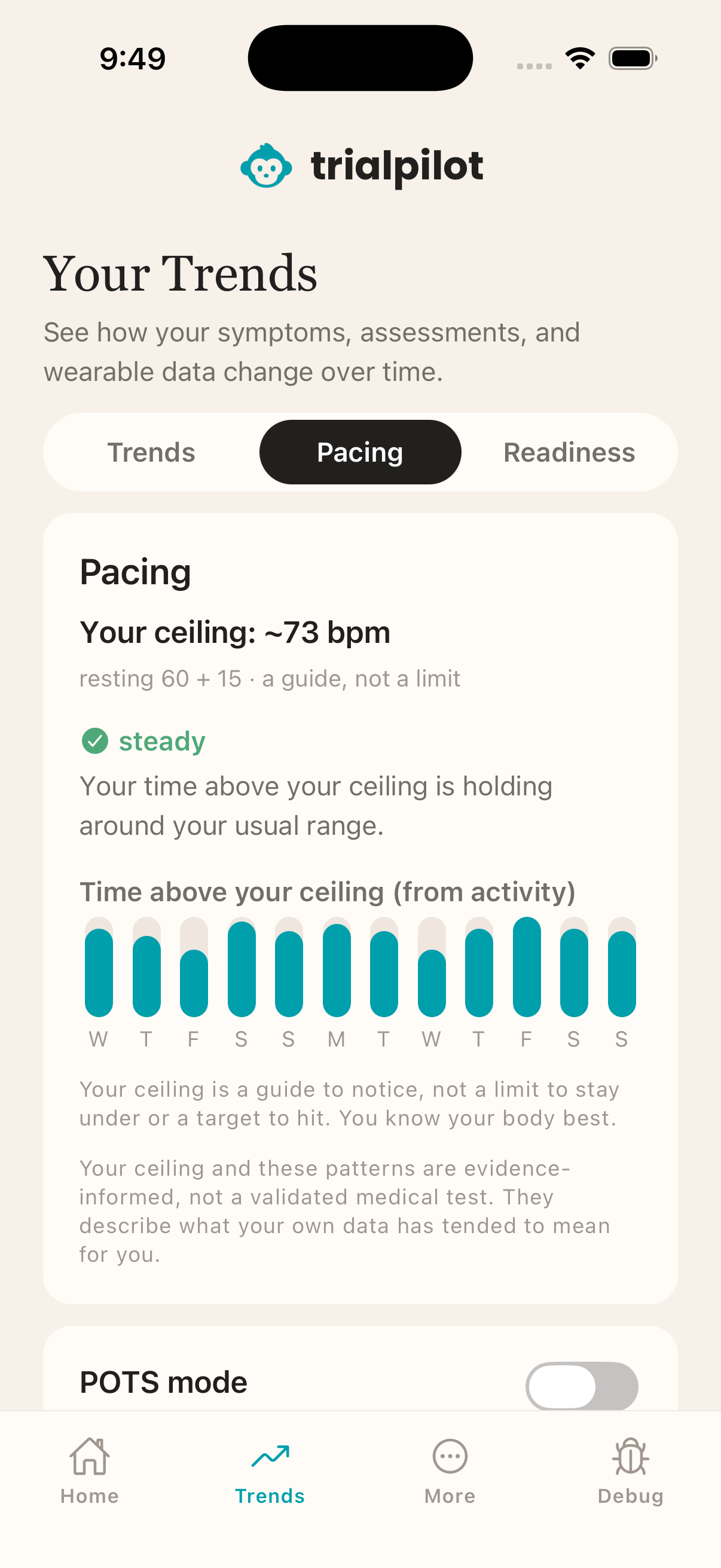
If you live with an energy-limiting illness like Long COVID or ME/CFS, you already know that some days cost more than others. Pacing views are built for exactly that: they can help you understand days when your body may be more taxed, using your own data rather than a one-size-fits-all rule.
When you have heart-rate data connected, pacing can include a personal heart-rate ceiling — a level based on your own body, not a population average. Time spent above it is shown as information about how demanding a day was, so you can decide what to do with that knowledge.
Pacing is not a score to beat. There are no goals to hit, no targets to chase, and nothing that penalizes a hard day. The views exist to give you a clearer picture, and what you do with that picture is entirely up to you.
Morning readiness signals#
Depending on your study and connected devices, the app may also show readiness-style signals — a morning look at how your body seems compared to your own recent data. Like pacing, these describe a pattern in your data. They do not predict how your day will go, and they are not instructions.
If your app does not show readiness views, nothing is wrong — not every study or device setup includes them.
Patterns, not predictions
Missed days are okay#
If you miss check-ins or your wearable does not sync for a stretch, your trends will simply show a gap. That is expected and completely fine. For many conditions, the days you could not check in are themselves meaningful — a gap can reflect a crash or a hard week, and researchers understand that.
There are no streaks to protect and no penalty for gaps. Pick things back up whenever you are able, and the views will keep building from wherever you are.
When your study finishes, the app turns your data into results you can actually read — see Results and study history.